GS Design System
A scalable component library built for a payroll platform used by thousands of HR administrators — creating a single source of truth for design and development.
The Challenge
Problem
The product had grown organically over time, resulting in inconsistent UI patterns across modules — buttons, forms, and tables looked and behaved differently depending on where you were in the app. Every new feature required design decisions that had already been made elsewhere.
Solution
We built a comprehensive design system in Figma — tokens, components, patterns, and documentation — that gave the entire product team a shared visual language, sped up design work, and made developer handoff significantly smoother.
Strategy
The system was built over 6 months by a 2-person team, covering every layer of the product's UI from foundational tokens to complex interactive patterns.
Visual Identity
The design system established a clear visual language built on a green-forward palette — Greenshades' brand color — paired with dark neutrals for data-heavy UI contexts.
Intuitive components
Every component was designed to feel familiar to HR administrators — reducing cognitive load and minimizing training time. From date pickers to inline notifications, each element follows consistent interaction patterns built with real payroll workflows in mind.
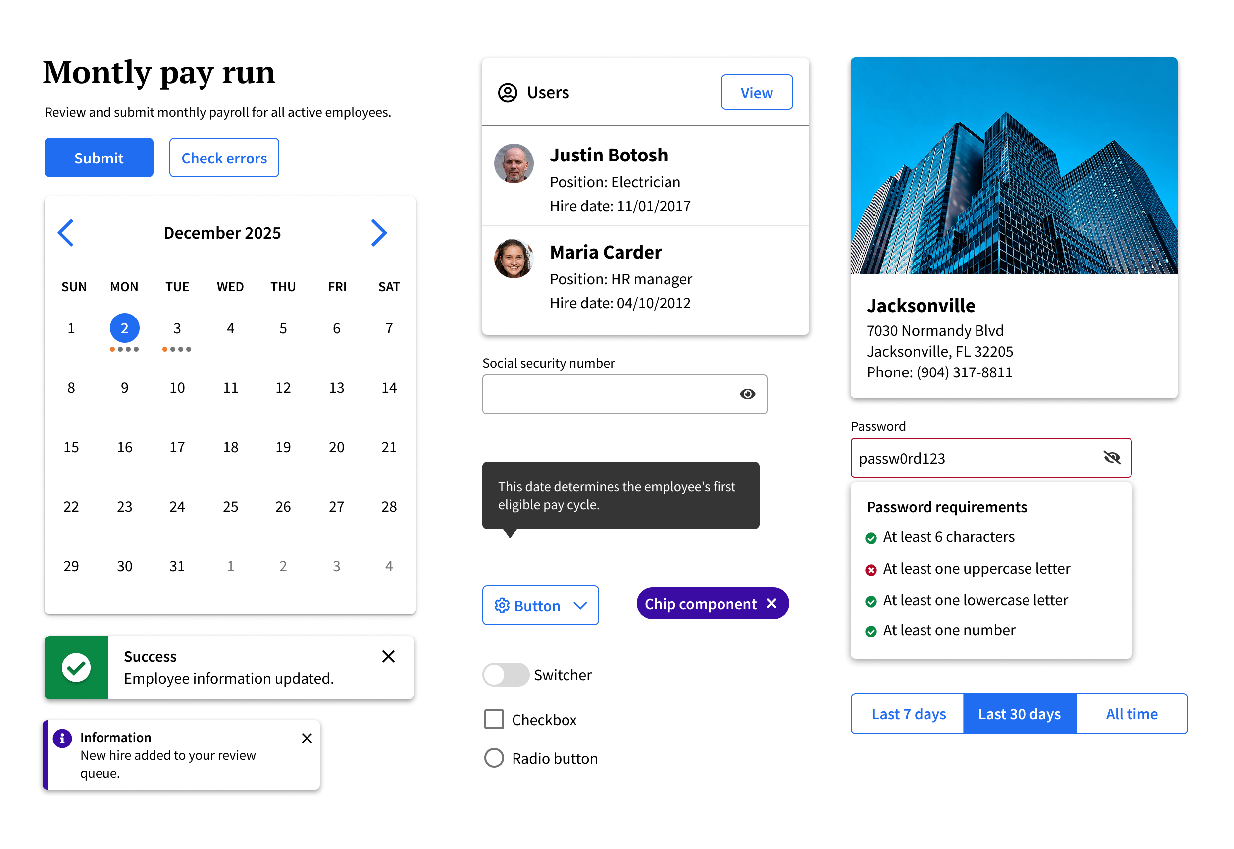
Design faster with prebuilt components and styles.
Predefined tokens for color, typography, and spacing — plus 70+ component variants ready to use across any payroll or HR screen.
Built with Figma's latest features and best practices.
Leverages auto layout, variables, and component properties — making customization quick and keeping handoff clean for developers.
Designed to be intuitive, accessible, and consistent.
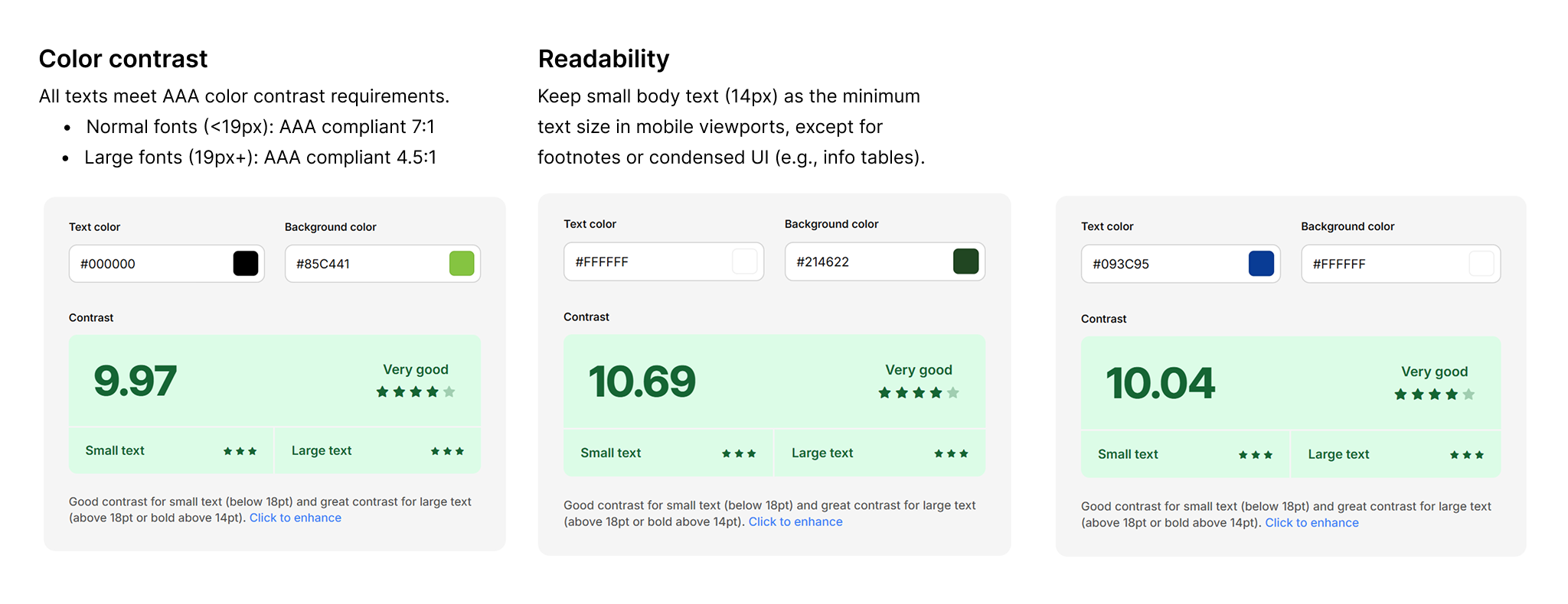
Every component was crafted with usability in mind — clear hierarchy, predictable interactions, and contrast ratios that meet WCAG 2.1 AA standards.
Scalable
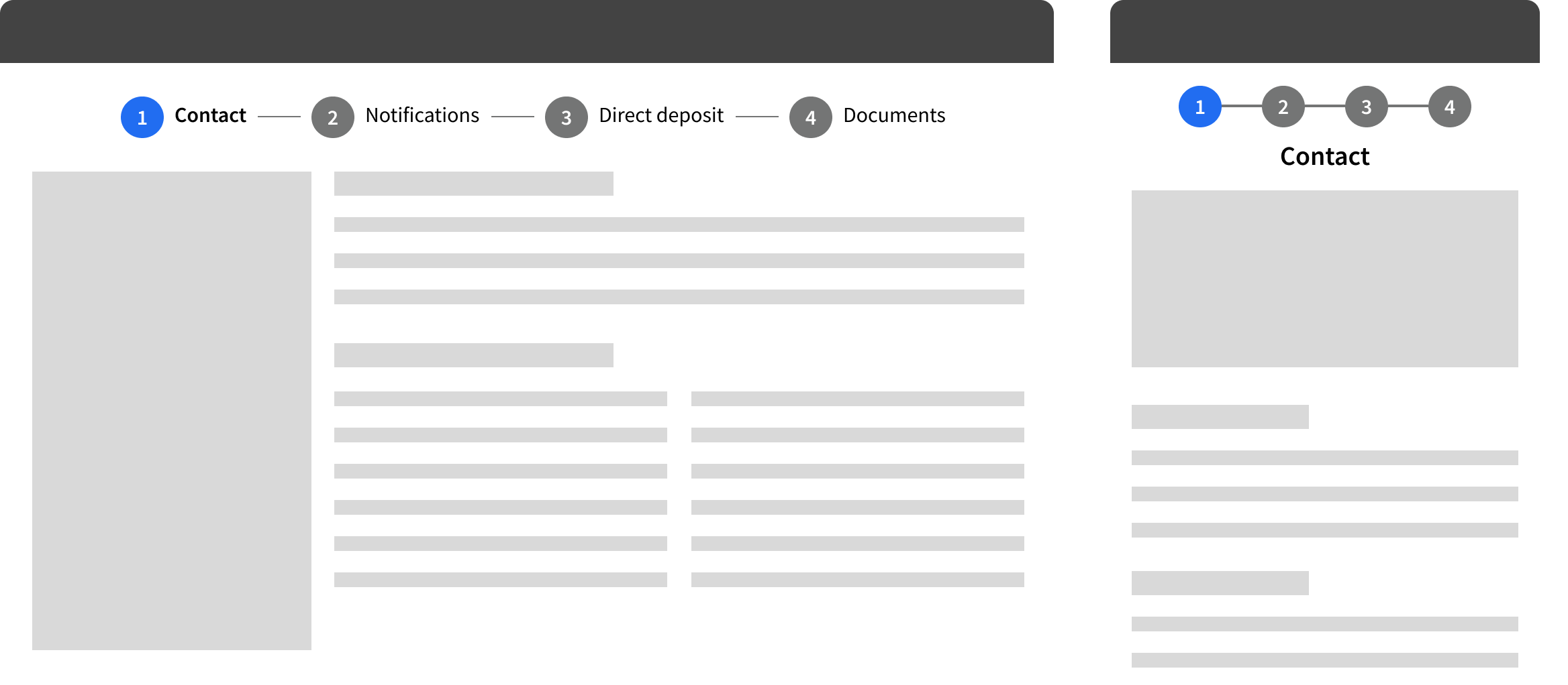
Thanks to a meticulously established auto-layout system, all components within the design system are now seamlessly scalable across various viewports. From mobile (375px) to tablet (768px), desktop (1024px), and even ultra-wide screens (1440+px), designers can effortlessly utilize the components to create UIs of any desired screen size.
Accessible
Ensuring accessibility is a paramount consideration during the development of the GS Design System. All components are designed following WCAG 2.1 (Web Content Accessibility Guidelines), guaranteeing they meet the necessary accessibility requirements prior to release. By doing so, we promote inclusivity and cater to the needs of diverse user groups.
Impact
Faster design-to-dev handoff
Components came with documented specs, variants, and behavior notes — developers could build from Figma directly without back-and-forth clarification rounds.
Consistent UI across all modules
The same button, the same table, the same form input — used everywhere. No more one-off styles or contradictory patterns across different parts of the product.
Single source of truth
Designers, developers, and PMs could all reference the same library — reducing ambiguity in reviews and making onboarding new team members significantly smoother.